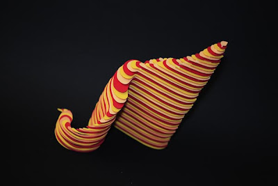
In his own words, the quote below is Steve Jobs discussing a calligraphy class he took at Reed College after he dropped out:
"I learned about serif and sans serif typefaces, about varying the amount of space between different letter combinations, about what makes a great typography great. It was beautiful, historical, artistically subtle in a way that science can't capture, and I found it fascinating."
(From Walter Isaacson's Steve Jobs biography, page 41.)
I think it is pretty cool to design a new typeface and I admire the talent of graphic artists who can create a brand new view of the alphabet. (For fun and to view some new fonts, click here.)
Additionally, I get intrigued by various art forms using letters and fonts. So, when I came across some recent work of Jérôme Corgier, a Parisian graphic artist (who recently won the Communication Arts award for his design of the New York Times Style Magazine Cover - see above), I was drawn to the work.
Jérôme creates a 3 dimensional type in the form of a paper sculpture. Mixing letters from Latin and Arabic alphabets, making paper cut outs of the same - with color - he blurs the line between art and function. The letters still have meaning but the meaning is different now, the form flows into a type of art. I can't decide if I really like it but I am interested in it. Want to see more?


No comments:
Post a Comment