Wednesday, August 15, 2012
Oh No... the Holidays Already??!


Monday, June 18, 2012
Casual June Wedding Invitation
 |
| Cream paper with red paper layer image. A coordinating liner completes the look. |

This June bride came to me just a few weeks ago - could we get something down fast enough for her June 23rd wedding? Absolutely, I would never let done a bride - love brides!
Hers is a casual backyard wedding and she wanted to incorporate nature, keep it elegant and not too feminine. I think we accomplished all that!
 |
| I love texture! |
Friday, June 1, 2012
Loving New York in the 1930s in Paris in 2012
On a recent trip to Paris, we happened upon a wonderful exhibit at the Jeu de Paume Museum. It was a real treat, a retrospective on the American photographer, Berenice Abbott, who spent many years in Paris, in the 1920s, socializing and working with many of the great intellectuals and artists of the time. To quote from the program description:
The exhibition also features a substantial selection of images form her Changing New York project (1935-1939), for which she is best known. This undertaking was Abbott’s own initiative but was financed by the Works Progress Administration, part of Roosevelt’s New Deal efforts to combat the Great Depression. Conceived as both a record of the city and a work of art in its own right, this ambitious government commission focuses on the contrast between the old and the new in the rapidly changing city.
I love the subject and her images are an incredible record of the City during the early 1930s.
And, of course this invitation was eye catching - an 1926 exhibit of her portrait work.

The exhibition also features a substantial selection of images form her Changing New York project (1935-1939), for which she is best known. This undertaking was Abbott’s own initiative but was financed by the Works Progress Administration, part of Roosevelt’s New Deal efforts to combat the Great Depression. Conceived as both a record of the city and a work of art in its own right, this ambitious government commission focuses on the contrast between the old and the new in the rapidly changing city.
I love the subject and her images are an incredible record of the City during the early 1930s.
And, of course this invitation was eye catching - an 1926 exhibit of her portrait work.

 |
| Jean Cocteau , poet and more, was one of her subjects |
The exhibit is currently in Toronto thru September 19th.
Friday, May 25, 2012
Viva Las Vegas! Billboard Music Awards Back in Town.
 |
| The fabulous invitation is housed in an onyx metallic portfolio |
 |
| Rehearsal |
 |
| See, just like us ordinary folk! |
 |
| A favorite stop of mine in the MGM GRAND |
 |
| A seating chart you can really visualize |
 |
| Carrie Underwood in dress rehearsal - gorgeous even though the photo doesn't do her justice |
 |
| Yes, I am a wedding stalker |
 |
| Cinnamon Monkey Bread, signature dessert at craftsteak - so yummy that I forced it on everyone at our table before our private Kelly Clarkson concert |
 |
| Decor at Kelly Clarkson Concert - MGM Ballroom |
 |
| The seating here was white leather but the lights reflect green |
 |
| Like watermelon |
 |
| Day of run thru |
 |
| My husband and I are ready to go |
 |
| Tickets and the after-party invite on silver metallic paper |
 |
| The Whitney Houston Tribute was wonderful - Jordan Sparks amazing! The crowd was given little finger lights to use during this moment |

 |
| Cee Lo Green never disappoints - love the white with crystal bling Adidas warm ups |
 |
| With Carson Kressley at The Mirage, my new BFF who happens to have a fabulous calling card, see below! |
 |
| Ecru card with black and gold ink, engraved - classic! |
Thursday, May 10, 2012
Is Fashion Art or Just Commerce?
| The Colbert Report | Mon - Thurs 11:30pm / 10:30c | |||
| Anna Wintour | ||||
| ||||
Anna Wintour speaks to Steve Colbert - watch and get ready to laugh out loud around the 4:10 minute mark. What do you think?
Friday, April 27, 2012
A Dynamic Duo - London Pictures
an intro to Gilbert & George
THE SINGING SCULPTURE IMPRESSES ALL DAY circa 1970
Click on the gallery above for more on this exhibit and the meaning (and better shots). Click here for more on Gilbert and George. Carol, Phlaxy and Anne, thanks for great company!


WARNING - THIS VIDEO BELOW HAS EXPLICIT IMAGERY
Friday, April 13, 2012
The Artistic Type
I love fonts. I am inspired by the different emotions a certain typeface can evoke. I love the drama, the whimsy, the playfulness of some and the sophistication of others. Steve Jobs was enamored with calligraphy and typeface as well and his study of this art played well into his style and product design at Apple. While I certainly have not yet achieved his type of success, I can relate to his interest in the subject.
In his own words, the quote below is Steve Jobs discussing a calligraphy class he took at Reed College after he dropped out:
"I learned about serif and sans serif typefaces, about varying the amount of space between different letter combinations, about what makes a great typography great. It was beautiful, historical, artistically subtle in a way that science can't capture, and I found it fascinating."
(From Walter Isaacson's Steve Jobs biography, page 41.)

In his own words, the quote below is Steve Jobs discussing a calligraphy class he took at Reed College after he dropped out:
"I learned about serif and sans serif typefaces, about varying the amount of space between different letter combinations, about what makes a great typography great. It was beautiful, historical, artistically subtle in a way that science can't capture, and I found it fascinating."
(From Walter Isaacson's Steve Jobs biography, page 41.)
I think it is pretty cool to design a new typeface and I admire the talent of graphic artists who can create a brand new view of the alphabet. (For fun and to view some new fonts, click here.)

Additionally, I get intrigued by various art forms using letters and fonts. So, when I came across some recent work of Jérôme Corgier, a Parisian graphic artist (who recently won the Communication Arts award for his design of the New York Times Style Magazine Cover - see above), I was drawn to the work.

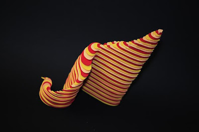
Jérôme creates a 3 dimensional type in the form of a paper sculpture. Mixing letters from Latin and Arabic alphabets, making paper cut outs of the same - with color - he blurs the line between art and function. The letters still have meaning but the meaning is different now, the form flows into a type of art. I can't decide if I really like it but I am interested in it. Want to see more?
Subscribe to:
Posts (Atom)